Neutral Bathroom Wall Tiles Design: Creating a Calm and Inviting Atmosphere
Table of Contents
Neutral Bathroom Wall Tiles Design
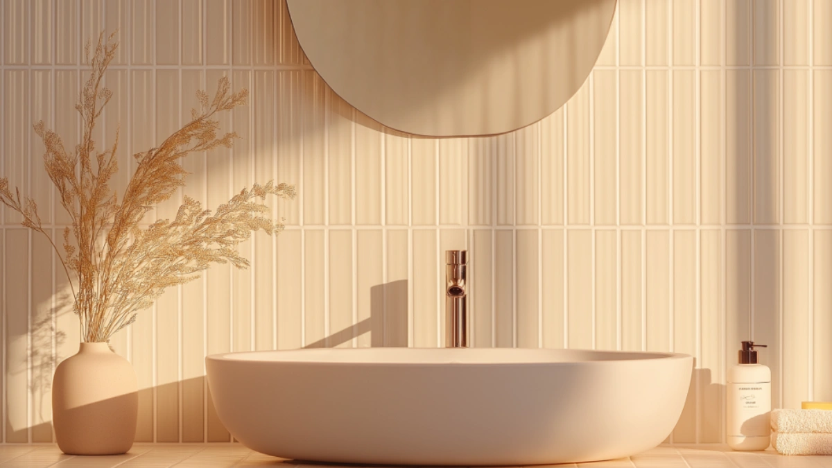
Bathrooms are more than functional spaces—they’re personal sanctuaries. Whether it’s your morning routine or a relaxing evening soak, the atmosphere in your bathroom sets the tone. A neutral color palette, especially when it comes to wall tiles, offers the perfect foundation for a space that feels serene, clean, and timeless. Neutral bathroom wall tile design is not only visually calming but also highly versatile, effortlessly complementing a variety of decor styles—from minimalist to modern farmhouse.
Studies in interior design consistently show that soft hues like whites, grays, taupes, and greiges enhance the perception of space and light. These colors also have a natural ability to promote relaxation, making them ideal for bathrooms. When used in tile form, neutrals gain depth and dimension through subtle patterns, finishes, and shapes.
In this guide, we’ll explore how to use neutral wall tiles to create a calm and welcoming atmosphere in your bathroom. From material choices and layout patterns to mix-and-match texture ideas and budget-friendly options, you’ll find everything you need to inspire your next update or renovation. Let’s begin transforming your bathroom into a tranquil retreat with the understated power of neutrals.
The Power of Neutrals in Bathroom Design
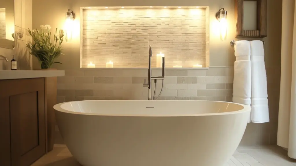
Neutrals are more than just “safe” color choices—they’re the foundation for elevated, timeless design. They bring balance to bold fixtures, expand small spaces, and establish a calming environment.
Why Neutrals Work So Well
- They reflect light, making small or windowless bathrooms feel bigger
- Pair effortlessly with natural materials like wood and stone
- Serve as a versatile backdrop for changing decor trends
Top Neutral Shades and Their Effects
| Shade | Tone Description | Ideal Effect in Bathroom Design |
|---|---|---|
| Warm White | Creamy, soft | Brightens the space, adds warmth |
| Cool Gray | Crisp, blue undertones | Modern, spa-like feel |
| Greige | Gray-beige hybrid | Softens the room with cozy elegance |
| Taupe | Earthy brown-gray | Adds depth while remaining subtle |
Pairing these shades with the right tile textures and finishes sets the tone for a calm and cohesive space.
Choosing the Right Tile Texture and Finish
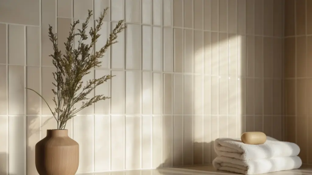
Tile finish plays a significant role in both the look and function of your bathroom walls. From matte to glossy, each finish offers unique advantages depending on the style you want to achieve.
Key Finishes to Consider
- Glossy: Reflects light, easy to clean, great for brightening small bathrooms
- Matte: Soft, understated, slip-resistant, ideal for serene environments
- Textured: Adds interest and contrast, especially in monochrome schemes
Tile Texture Comparison Chart
| Finish Type | Benefits | Best For |
|---|---|---|
| Glossy | Light-enhancing, sleek | Contemporary, small bathrooms |
| Matte | Soft, modern, fingerprint-resistant | Zen and minimal spaces |
| Textured | Visual depth, hides water spots | Feature walls, organic designs |
Layering different finishes (e.g., matte tiles with a glossy trim) can elevate even the simplest palette.
Tile Layout Patterns that Enhance Calm
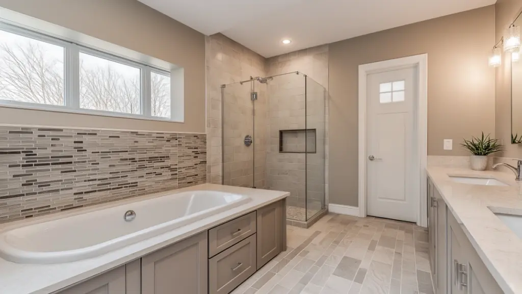
Even with a neutral palette, how you lay your tiles makes a big impact. Certain tile arrangements create movement, while others emphasize balance and stillness.
Popular Layouts for Neutral Wall Tiles
- Horizontal Subway: Classic and spacious
- Vertical Stack: Modern and elongating
- Herringbone: Dynamic yet elegant
- Grid: Minimalist, structured, and calming
Tile Layout Comparison
| Layout Style | Visual Effect | Suggested Use |
|---|---|---|
| Horizontal Subway | Traditional, widens the space | Main wall, entire bathroom |
| Vertical Stack | Heightens and simplifies | Shower walls, niches |
| Herringbone | Adds movement and luxury | Feature wall, backsplash |
| Grid | Balanced and serene | All-over wall application |
A calm layout with precise lines can emphasize the natural beauty of your tile choice.
Combining Tile Shapes for Depth and Interest (Expanded Section)
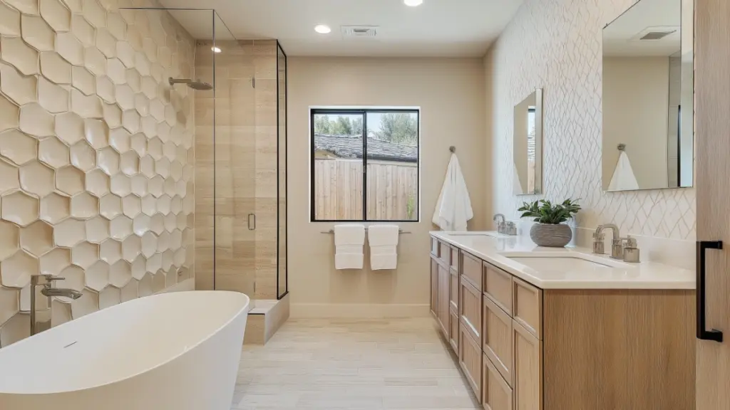
Neutral doesn’t mean boring. You can bring visual richness to your bathroom by mixing different tile shapes, sizes, or formats—all while sticking to a soft, calming color scheme.
Smart Pairings
- Pair large-format rectangular tiles with smaller mosaic accents
- Use hexagonal tiles on one wall and simple rectangles elsewhere
- Try combining square tiles on the lower half of the wall with vertical tiles above
Benefits of Mixing Shapes This approach adds rhythm and breaks monotony without overwhelming the eye. You maintain a cohesive, relaxing tone while subtly drawing attention to focal points like the vanity or shower.
Shape Combinations Breakdown
| Shape 1 | Shape 2 | Effect Created |
|---|---|---|
| Subway Tiles | Mosaic Squares | Textural contrast, classic + detail |
| Hexagon Tiles | Vertical Planks | Organic meets modern structure |
| Large Squares | Thin Rectangles | Bold surface + sleek backdrop |
Stick to two or three shapes max in the same neutral family to avoid visual chaos. Keep grout lines consistent in tone for a seamless look.
Warm vs. Cool Neutrals: Which to Choose?
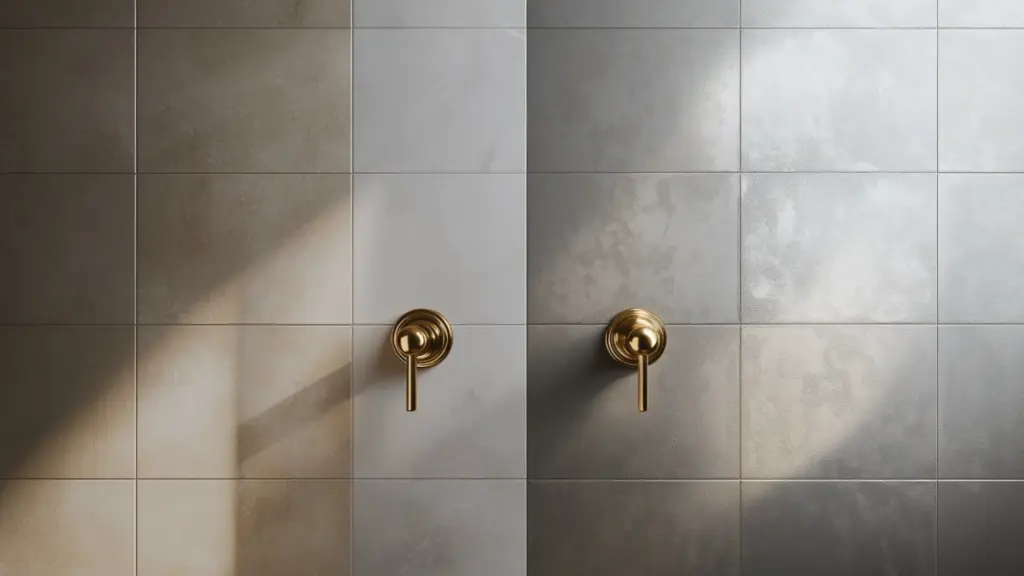
Choosing between warm and cool neutrals affects the overall mood of your space. Warm tones invite coziness, while cool tones evoke cleanliness and tranquility.
When to Use Warm Neutrals
- In bathrooms with little natural light to add warmth
- To complement brass or wood accents
- To create a cottage, rustic, or Mediterranean look
When to Use Cool Neutrals
- For a sleek, contemporary or spa-inspired space
- In well-lit bathrooms to maximize the sense of airiness
- To pair with chrome, black, or glass finishes
Comparison Table
| Neutral Type | Mood Created | Best Paired With |
|---|---|---|
| Warm | Cozy, inviting | Brass fixtures, oak vanities |
| Cool | Clean, refreshing | Chrome, marble, glass |
Your choice may come down to personal preference—but even more, the direction your bathroom faces and how much natural light it gets.
Feature Walls and Accent Zones (Expanded Section)
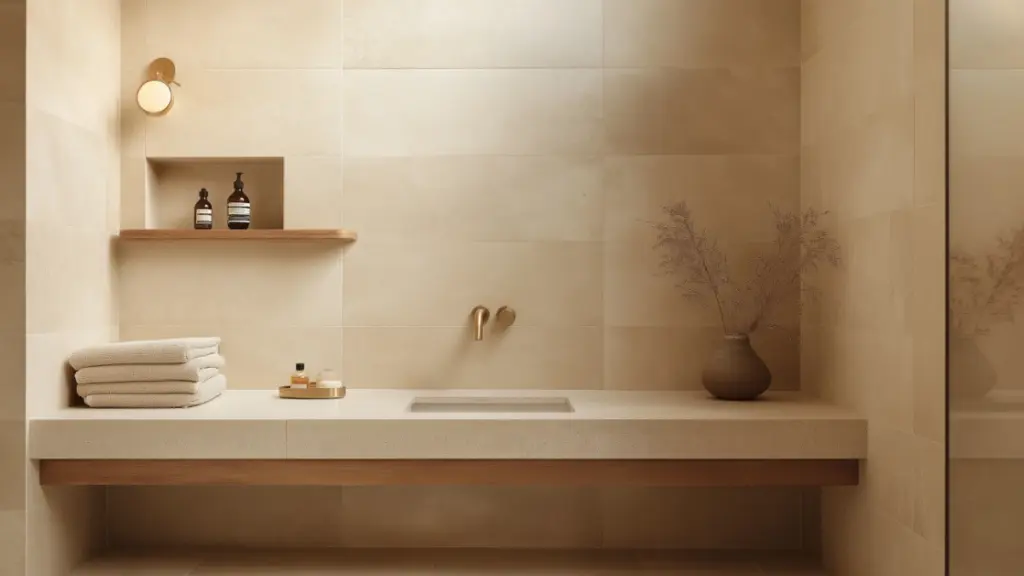
Not every wall needs the same treatment. Using your neutral tiles to create a subtle feature wall or accent area can bring gentle focus and layered design to your bathroom.
Where to Create a Feature Wall
- Behind the vanity mirror or sink
- In the shower or tub enclosure
- On the back wall in a powder room
Feature Wall Techniques
- Use the same tile but in a different pattern (e.g., herringbone in one area)
- Opt for slightly darker tiles in the same hue family
- Add a soft contrast with textured or 3D tile finishes
Accent Zone Placement Ideas
| Area | Design Suggestion | Visual Effect |
|---|---|---|
| Vanity Wall | Vertical stacked tiles, matte finish | Heightened and elegant |
| Shower Niche | Mosaic detail in same color range | Artistic and functional |
| Half-Wall Section | Contrasting tile shape | Layered and modern look |
These gentle focal points don’t break the serenity of the space—instead, they enhance its design with subtlety and elegance.
Pairing Tiles with Fixtures and Decor
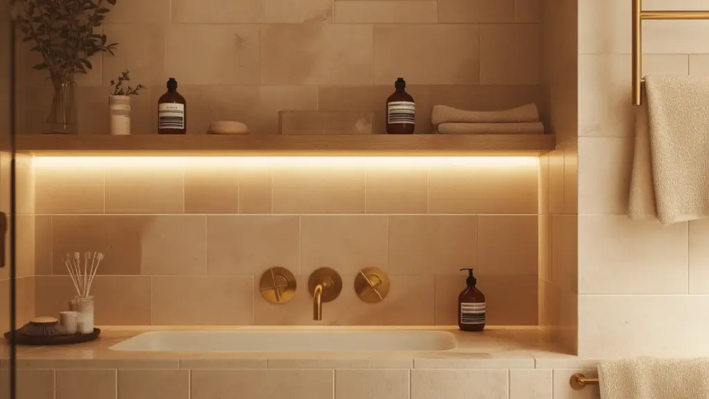
To truly complete the atmosphere, your neutral wall tiles should complement the surrounding finishes—faucets, lighting, mirrors, and storage.
Top Material Matches
- Warm neutrals with brushed brass or gold
- Cool grays with black or chrome fixtures
- Creams and whites with natural wood accents
Decor Pairing Table
| Tile Tone | Fixture Material | Recommended Decor Accents |
|---|---|---|
| Beige or Taupe | Brass, Gold | Woven baskets, linen textiles |
| Soft Gray | Matte Black, Chrome | Monochrome prints, glass shelves |
| White or Ivory | Wood, Ceramic | Potted plants, minimalist candles |
Coordinating your tile tones with hardware and styling pieces brings visual harmony and enhances the overall mood of the room.
Conclusion
Neutral bathroom wall tile design offers the ideal balance of timelessness and tranquility. Whether you lean toward warm tones for cozy comfort or cool shades for modern serenity, neutrals serve as the perfect canvas for a calm and inviting space. Through thoughtful use of texture, shape, layout, and complementary finishes, even the most minimal palette can deliver visual richness and personal style. In the end, a neutral bathroom is about creating a place of peace—a daily retreat where elegance meets simplicity.
