Timeless Living Room Paint Colors That Never Go Out of Style
Table of Contents
Trends may come and go, but some living room paint colors stand the test of time. They don’t just match current fads—they create a calm, cohesive atmosphere that transcends passing design waves. The right timeless paint color enhances your furniture, sets the mood, and effortlessly adapts as your home evolves.
A well-chosen wall color can transform your living room into a soothing retreat or a sophisticated gathering space. According to interior designers, neutrals and nature-inspired tones consistently top the charts for longevity because they offer flexibility, style, and a canvas for personal expression. Whether you’re renovating, repainting, or designing your first home, selecting a paint color that will still feel relevant five or ten years from now is a smart investment.
In this post, we’ll explore a curated list of timeless living room paint colors that never go out of style. From soft whites and warm beiges to earthy greens and deep navies, we’ll break down what makes each hue so enduring. Along the way, you’ll find expert tips, color pairings, and image prompts to visualize these classic shades in your space.
Warm Beige: Classic Comfort with Subtle Elegance
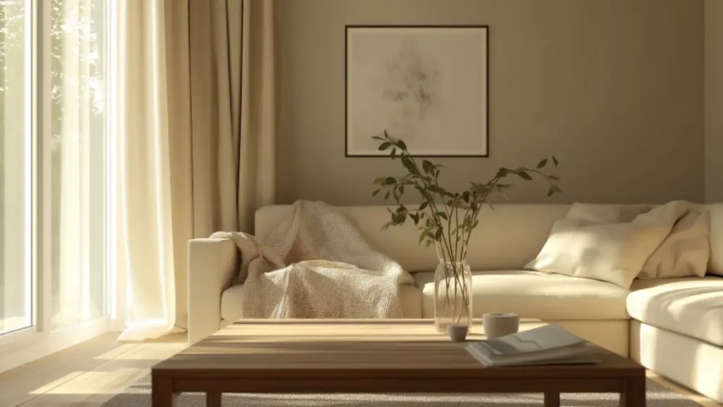
Warm beige has long been a staple in timeless interiors—and for good reason. Its soft, creamy undertones bring warmth without overwhelming the space, creating an inviting and understated backdrop that works in both modern and traditional living rooms.
Beige tones like “Accessible Beige” or “Manchester Tan” provide just enough color to add interest, yet remain neutral enough to support a wide variety of accent shades. This makes them ideal for homeowners who love changing throw pillows, rugs, and artwork with the seasons.
What keeps warm beige in style is its ability to bridge the gap between cool grays and rich browns. It’s cozy without being too yellow, sophisticated without being stark. It complements wood furniture, natural fiber rugs, and earth-toned accessories beautifully.
Pairing Suggestions for Warm Beige Walls
| Complementing Element | Ideal Tones or Materials |
|---|---|
| Sofa upholstery | Cream, taupe, soft brown |
| Trim and ceiling | Warm white or ivory |
| Wood finishes | Oak, walnut, or rattan |
| Accent colors | Sage, rust, navy |
Soft White: Crisp, Clean, and Universally Chic
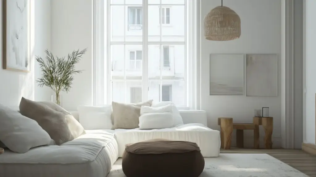
There’s nothing more versatile—or enduring—than a beautifully chosen soft white. Far from feeling sterile, a well-balanced white offers a clean slate that enhances natural light and adds a touch of refinement to any living room.
Shades like “Chantilly Lace,” “Swiss Coffee,” or “Simply White” bring subtle undertones of cream or gray that prevent the space from feeling too stark. They’re a favorite in farmhouse, Scandinavian, and minimalist interiors, yet they also serve as a bright base for eclectic or traditional designs.
Soft whites make small living rooms feel more open and airy. They also allow for bold furniture choices, colorful art, and a wide mix of textures without clashing.
Pros and Cons of Using Soft White Paint
| Feature | Benefit | Consideration |
|---|---|---|
| Enhances light | Brightens dark or small rooms | May require frequent cleaning |
| Pairs with everything | Works with all decor styles | Needs good lighting to shine |
| Clean, timeless look | Great resale value | Avoid stark, cool-toned whites |
Earthy Greens: Calming, Nature-Inspired Neutrals
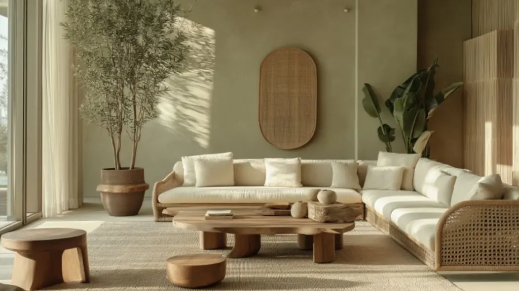
Green might not be the first color you associate with timelessness, but soft, earthy greens have proven their staying power. Muted sage, olive, and mossy tones bring nature indoors, grounding your space and creating a peaceful ambiance.
Earthy greens work particularly well with natural textures—think linen curtains, jute rugs, and raw wood furniture. These shades feel organic and sophisticated, making them perfect for biophilic design lovers or those looking to add personality without overwhelming the room.
Popular options like “Clary Sage” or “Pale Oak” with green undertones offer a fresh take on neutral living room walls while still feeling classic and cozy.
Styling Earthy Green Walls
| Design Element | Ideal Pairing |
|---|---|
| Furniture fabrics | Cream, tan, brown leather |
| Wood tones | Light oak, distressed pine |
| Accent colors | Terracotta, navy, brass |
| Floor rugs | Geometric or Moroccan patterns |
Greige—The Best of Both Worlds
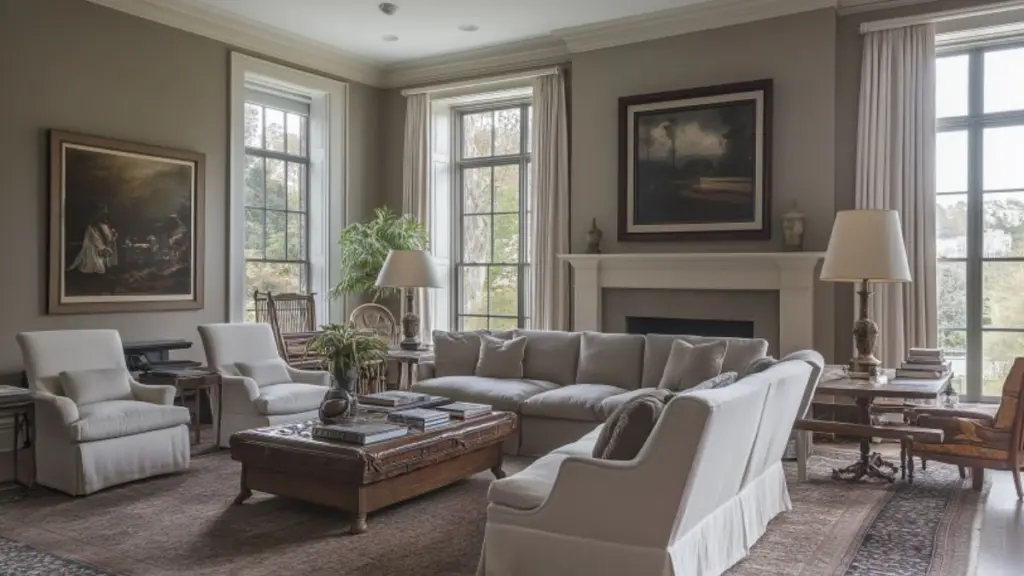
If you’re torn between gray and beige, greige is your go-to. This hybrid color blends the warmth of beige with the cool sophistication of gray, resulting in a perfectly balanced hue that adapts to virtually any style.
Greige tones like “Revere Pewter,” “Agreeable Gray,” or “Edgecomb Gray” remain top choices for living rooms because of their flexibility. In warm lighting, they appear beige; in cooler light, they lean gray. This chameleon-like quality makes them especially ideal for rooms that serve multiple functions—like living spaces that also act as offices or guest lounges.
Beyond aesthetics, greige’s enduring appeal lies in its subtlety. It provides depth without drama and acts as a canvas for a broad color palette—from soft pastels to bold jewel tones.
Greige Paint Guide
| Attribute | Why It Works |
|---|---|
| Neutral base | Complements both cool and warm decor |
| Light reflective | Keeps room feeling open and airy |
| Adaptable shade | Works in modern, rustic, and classic rooms |
| Layering potential | Blends seamlessly with wood, metal, fabric |
Tips for Using Greige Successfully:
- Use warm LED lighting to enhance its beige tones.
- Pair with white trim for crisp contrast.
- Mix in bold textures—velvet, leather, or wool—for interest.
- Consider matte finishes for added elegance.
Navy Blue for Depth and Sophistication
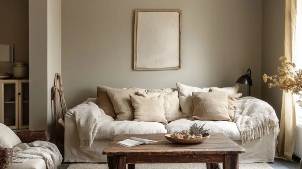
While navy might seem bold, it’s a classic color that has earned its place among timeless living room hues. This rich, saturated shade adds depth and elegance while acting as a refined alternative to black or dark gray.
Navy works beautifully as an accent wall or in full-room applications when balanced with lighter furnishings and reflective materials. It pairs exceptionally well with white trim, brass fixtures, and crisp linen fabrics.
Designers often turn to navy for moody libraries, formal sitting rooms, or eclectic modern spaces. Despite its intensity, navy doesn’t feel trendy—it has a deep-rooted charm that recalls traditional tailoring, naval design, and timeless interiors.
Design Benefits of Navy Walls
| Feature | Impact |
|---|---|
| Saturated depth | Creates intimacy and contrast |
| Neutral backbone | Surprisingly versatile |
| Statement-making | Elevates minimal furniture |
| Works with metallics | Pairs beautifully with brass, gold, or silver |
Ideas for Styling with Navy:
- Add high-contrast accents like white sofas or marble tables.
- Incorporate texture through velvet cushions or woven throws.
- Use ambient lighting (e.g., wall sconces) to soften shadows.
- Consider navy built-ins for a cohesive, custom look.
Taupe and Mushroom Tones for Organic Sophistication
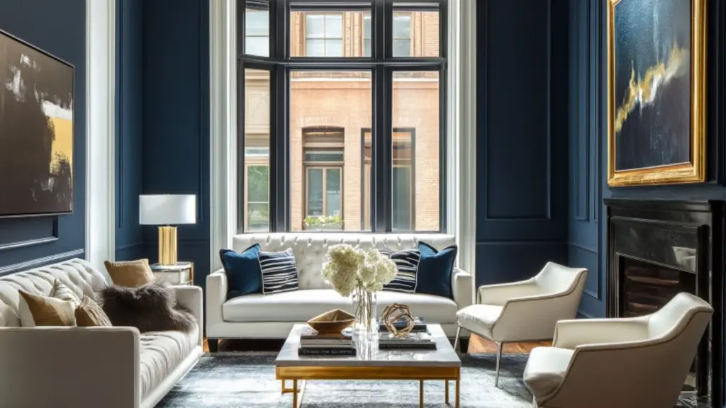
Taupe is a soft brown-gray that feels earthy, elegant, and effortless. Similar to greige, but warmer and dustier, taupe evokes a sense of calm and works particularly well with soft textures and layered neutrals.
Mushroom tones take this a step further, introducing a subtle hint of warmth that reads as classic without ever feeling bland. These shades are timeless because they harmonize with both contemporary and vintage styles, offering enough contrast without overwhelming.
Both taupe and mushroom are ideal for cozy, lived-in living rooms where relaxation is the focus. They pair well with leather, natural stone, and aged wood.
Taupe vs. Mushroom Wall Colors
| Tone Characteristic | Taupe | Mushroom |
|---|---|---|
| Undertone | Cooler brown-gray | Warm beige-gray |
| Best Paired With | Ivory, charcoal, warm woods | Sage, dusty pink, vintage rugs |
| Room Style | Transitional, rustic | Cottagecore, modern vintage |
Cool Gray: Sophisticated, Sleek, and Adaptable
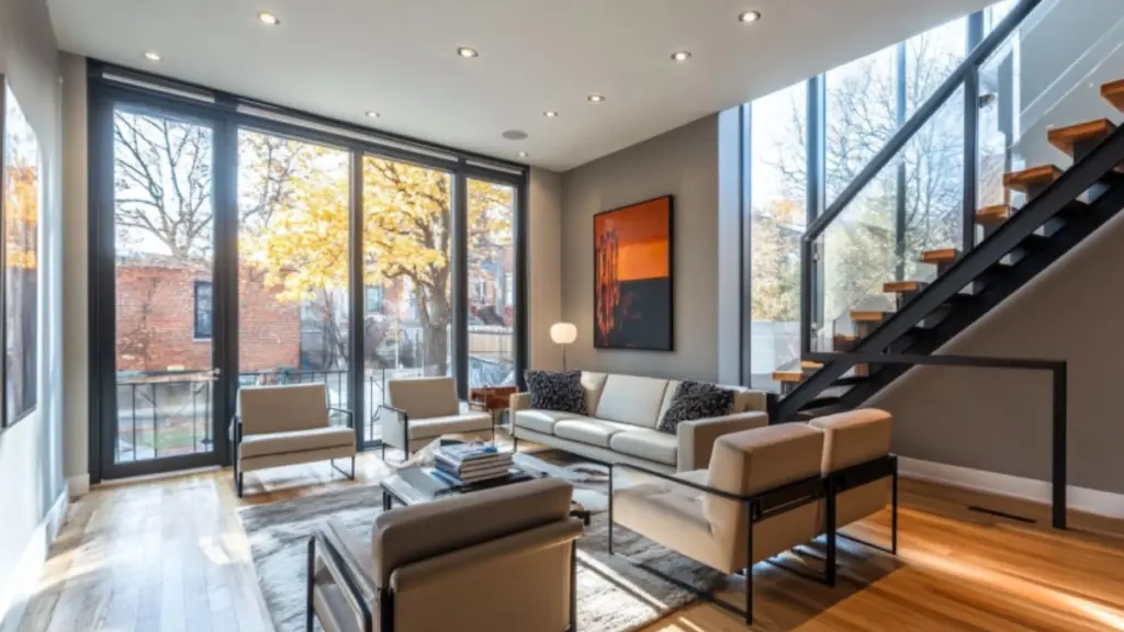
Cool gray remains one of the most popular paint choices for modern homes. Its clean, crisp feel lends itself to minimalist and urban interiors while still maintaining a timeless appeal when layered with the right accents.
Colors like “Stonington Gray” or “Gray Owl” strike a balance between industrial coolness and subtle sophistication. These tones shine in rooms with lots of natural light and pair well with black, chrome, and glass elements.
However, to avoid making the space feel cold, it’s important to incorporate warm materials—like plush rugs, soft lighting, and warm-hued wood tones.
Gray Paint Styling Table
| Accent Material | Best Use Case |
|---|---|
| Warm-toned wood | Adds warmth and balance |
| Black metal | Sleek, modern contrast |
| Soft white textiles | Lightens the palette |
| Deep blue or blush | Adds depth or softness |
Conclusion
Timeless living room paint colors don’t just blend in—they provide a lasting foundation that enhances your space year after year. Whether you’re drawn to soft whites, earthy greens, or moody navies, these classic shades offer flexibility, elegance, and comfort that never go out of style.
Choosing a color that reflects both your personality and your home’s architecture ensures your living room feels fresh, grounded, and beautifully livable—today and for years to come. The key is balance: find a shade that supports your decor, adapts to changing trends, and makes your living room feel like home.

