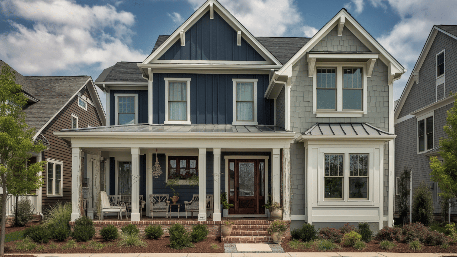
How to Choose the Perfect Exterior Color Palette for Your Home: Timeless Tips for Every Style
Table of Contents
Color is one of the most powerful design tools you have—especially when it comes to the exterior of your home. In fact, real estate experts say that choosing the right paint colors can boost your home’s curb appeal and increase its perceived value by up to 10%. But selecting the perfect exterior color palette isn’t always simple. With endless shades and combinations available, it’s easy to feel overwhelmed.
Do you go bold or stay classic? Should trim contrast or blend in? What about the roof, landscaping, and neighborhood trends? These are all important questions that homeowners face when updating their home’s exterior.
The good news is, you don’t need to be a designer to get it right. In this post, we’ll walk you through everything you need to know to choose an exterior color scheme that flatters your home, complements your surroundings, and stands the test of time. We’ll explore the role of undertones, architectural style, neighborhood aesthetics, and even the psychology of color. With clear examples, practical advice, and a few inspiring visuals, this guide will help you feel confident making one of the most transformative decisions for your home’s appearance.
Consider Your Home’s Architectural Style First
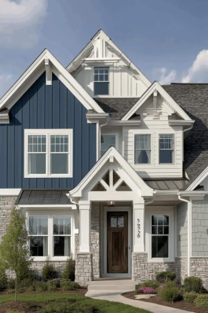
Your home’s architectural style should be the starting point for any color decision. Different home styles have historically favored certain palettes, and honoring these cues will make your exterior feel cohesive and timeless.
For example, a Colonial-style home traditionally looks best in classic, symmetrical color schemes—think navy with crisp white trim or soft gray with black shutters. On the other hand, a mid-century modern home may embrace earthy tones like olive green or burnt orange, complemented by natural wood accents.
Ignoring architectural cues can result in a disjointed look, where the color feels at odds with the structure itself. It’s not about limiting creativity—it’s about choosing colors that enhance the home’s natural beauty.
Table: Color Palettes by Architectural Style
| Home Style | Recommended Color Palette | Trim Suggestions |
|---|---|---|
| Colonial | Navy, gray-blue, warm white | Bright white, black shutters |
| Craftsman | Sage, olive, deep taupe | Cream, dark brown |
| Modern Farmhouse | Soft white, greige, muted green | Matte black or natural wood |
| Mid-Century Modern | Terracotta, charcoal, mustard | Wood tones, bold contrasts |
| Mediterranean | Cream, coral, dusty peach | Terracotta or bronze accents |
Work with Fixed Elements That Won’t Change
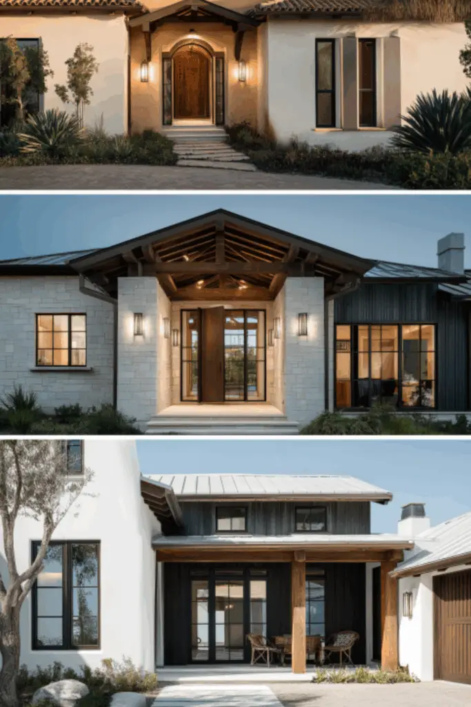
Before you select any paint swatches, take a look at the elements of your home that are staying put. The roof, brickwork, stone, pavers, and even your driveway create a visual framework that your paint colors need to work with—not against.
If you have a gray slate roof, for instance, cool undertones like icy blue or crisp white will complement it better than warm tones like beige. Similarly, red brick pairs beautifully with classic whites, blacks, and deep greens, but may clash with bright or neon hues.
These fixed features often carry undertones—like warm red, cool gray, or golden brown—that can guide your palette choices. Ignoring these tones could lead to a mismatched look that feels unpolished, even if the colors are beautiful on their own.
Visual Table: Matching Paint to Fixed Exterior Features
| Fixed Element | Undertone | Complementary Color Ideas |
|---|---|---|
| Red Brick | Warm | Cream, deep green, charcoal |
| Slate Roof | Cool gray | Soft blue, white, steel |
| Beige Stone | Warm neutral | Olive, ivory, muted terra cotta |
| Concrete Pathway | Cool gray | Crisp white, navy, charcoal |
Use the Rule of Three for a Balanced Palette
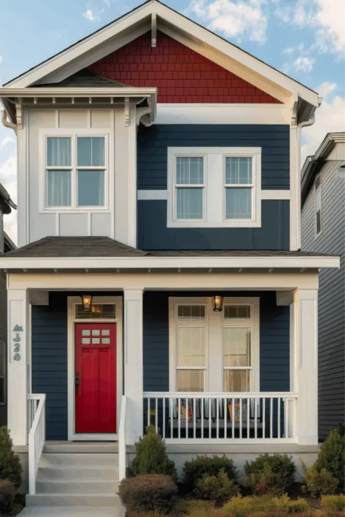
Creating a color palette doesn’t mean picking just one color. The most effective and visually balanced exteriors usually follow the “Rule of Three”: a main body color, an accent color, and a trim color.
The main body color covers the bulk of your home’s facade. This could be a soft gray, navy, or off-white, depending on your taste and the surrounding environment. The trim color should highlight features like window frames, fascia boards, and doors, providing crisp contrast or seamless blending. The accent color is used sparingly on shutters, doors, or decorative elements to add depth and personality.
This layered approach ensures that no single color dominates or overwhelms the eye. It also allows flexibility—so if you want to make a bold statement, you can do it in your accent color without committing to it everywhere.
Table: Applying the Rule of Three to Your Home
| Role | Typical Placement | Color Tip |
|---|---|---|
| Main Body | Siding, stucco, primary facade | Choose a timeless, medium-neutral |
| Trim | Windows, fascia, railings | Go lighter or darker than body color |
| Accent | Doors, shutters, small architectural detail | Add contrast or personality pop |
Factor in Natural Lighting and Regional Climate
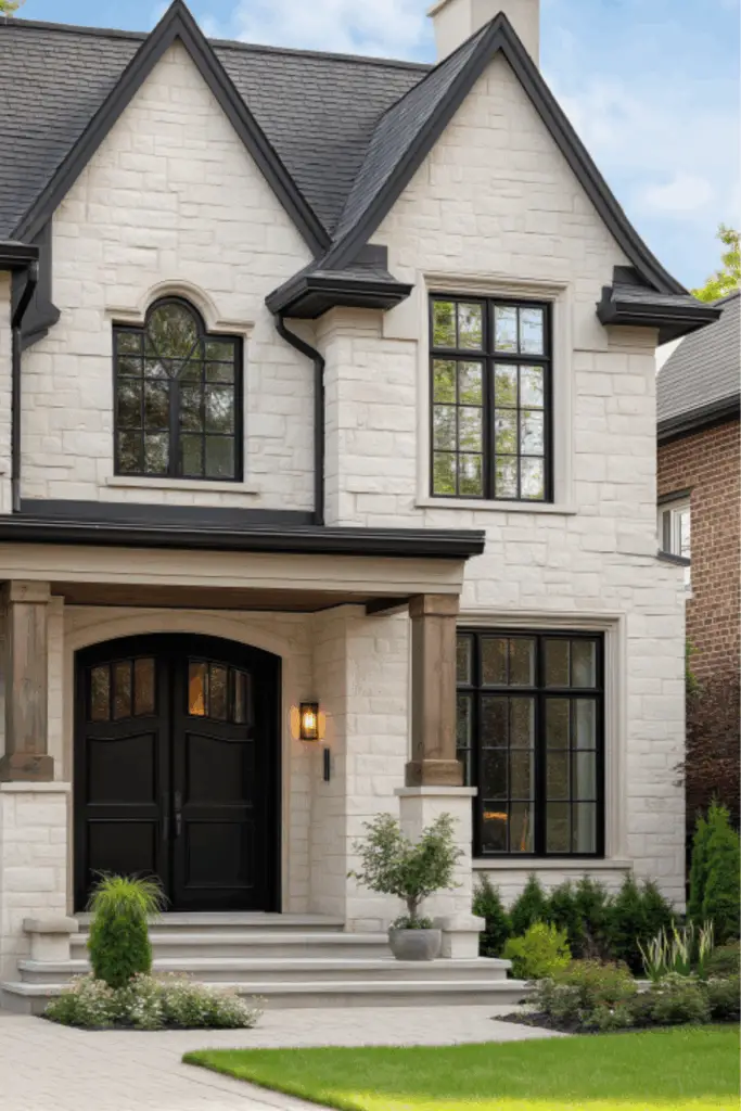
One often overlooked aspect of choosing an exterior color palette is the impact of natural lighting and regional climate. Light plays a significant role in how color is perceived outdoors. A color that looks soft and neutral in the store may appear washed out in full sun or too dark in cloudy conditions.
In bright, sunny climates—like the Southwest or California—colors tend to appear lighter. Therefore, many homeowners opt for rich tones or earth-based hues like clay, ochre, or deep olive to avoid fading or looking too pale. In contrast, homes in overcast regions benefit from brighter or warmer tones to add life and warmth.
Humidity and seasonal shifts also matter. In tropical areas, bold coastal colors like aqua or coral often look natural. Meanwhile, in snowy northern zones, deep charcoal or forest green can ground the home and provide striking contrast against white snow.
Always test your color choices in natural daylight on different sides of the home before committing.
Table: Color Considerations Based on Regional Climate
| Region/Climate | Lighting Type | Color Strategy |
|---|---|---|
| Sunny Southwest | Bright/direct sun | Use saturated or warm earth tones |
| Pacific Northwest | Overcast/cloudy | Go with brighter or warm-leaning neutrals |
| Coastal Tropics | Intense light + humidity | Cool tones with crisp whites |
| Cold/Northern | Snowy + low light | Deep, bold colors for contrast |
Explore Color Psychology to Reflect Your Personality
Color doesn’t just impact how your home looks—it affects how it feels. This is where color psychology comes in. The shades you choose tell a story about your personal style, and they can also set a tone for how guests and neighbors perceive your home.
Blues and grays often evoke calm, stability, and tradition—ideal for those who value a timeless, understated look. Earthy greens and browns suggest warmth and connection to nature, perfect for homeowners seeking a grounded, organic aesthetic. Bold hues like red or yellow express confidence and creativity, making them great choices for front doors or shutters.
Choosing exterior colors with intention allows your home to make a quiet statement that aligns with your lifestyle.
Color Psychology Chart for Exterior Design
| Color | Emotional Impact | Ideal Use in Exterior Design |
|---|---|---|
| Blue | Calm, trustworthy, classic | Main color or accent on traditional homes |
| Green | Nature-loving, balanced | Great for Craftsman or bungalow styles |
| Gray | Sophisticated, timeless | Body or trim color for urban settings |
| Yellow | Cheerful, welcoming | Accent or front door |
| Black | Elegant, bold | Trim or shutters for modern contrast |
Test Your Palette with Samples Before Committing
Once you’ve narrowed down your color choices, it’s time to test—this step is non-negotiable. What looks great on a swatch or screen may look completely different when painted on a larger surface, under natural light, and against your home’s existing features.
Start by ordering sample pots of your top three color combinations. Paint large swatches (at least 2′ x 2′) directly on different parts of your home: near the front door, along the main siding, and beside any fixed elements like stone or trim. Observe the samples at different times of day and in various weather conditions.
Be sure to label each sample and take photos for comparison. It’s surprising how much light can change a shade from morning to evening. Also, walk across the street to see how the palette reads from a distance.
This step gives you peace of mind and helps avoid costly repainting.
Table: Smart Sampling Strategy
| Step | Purpose | Pro Tip |
|---|---|---|
| Choose 2–3 color trios | Compare multiple palette options | Include light, medium, and dark options |
| Paint large swatches | See color in context | Paint directly on siding, not on boards |
| View in different lighting | Assess how colors shift with sun/clouds | Check morning, midday, and evening views |
| Take distance photos | Assess curb appeal | Step back to street view perspective |
Coordinate with Landscaping and Exterior Decor
Your color palette shouldn’t stop at the walls—it should harmonize with the entire outdoor environment. This includes landscaping, fencing, lighting, mailboxes, and even seasonal decor.
For example, a deep green home set against lush landscaping creates a serene, forested retreat. A white or taupe home with flowering shrubs and navy shutters evokes a classic New England feel. Even porch planters, front door wreaths, and house numbers contribute to the overall vibe.
If you love seasonal decor, choose a neutral palette that accommodates pumpkins in fall, garlands in winter, and bright blooms in spring without feeling visually crowded.
Exterior Harmony Checklist
| Element | Coordination Tip |
|---|---|
| Landscaping | Match undertones with paint (warm vs. cool) |
| Outdoor Furniture | Keep colors complementary or neutral |
| Lighting Fixtures | Match trim or hardware for cohesion |
| Decor/Planters | Choose pops of color that don’t clash |
Conclusion
Choosing the perfect exterior color palette for your home is both an art and a science. It requires an understanding of your home’s architecture, awareness of fixed elements, respect for regional influences, and a bit of personal flair. The most successful color combinations are not just visually appealing—they tell a story, enhance curb appeal, and stand the test of time.
By following the principles outlined in this guide—from the rule of three to testing samples in natural light—you’ll feel more confident making one of the most transformative decisions for your home. And remember, your home’s exterior is its first impression. Make it one that reflects your taste, welcomes guests, and makes you smile every time you pull into the driveway.

